Example of published banners
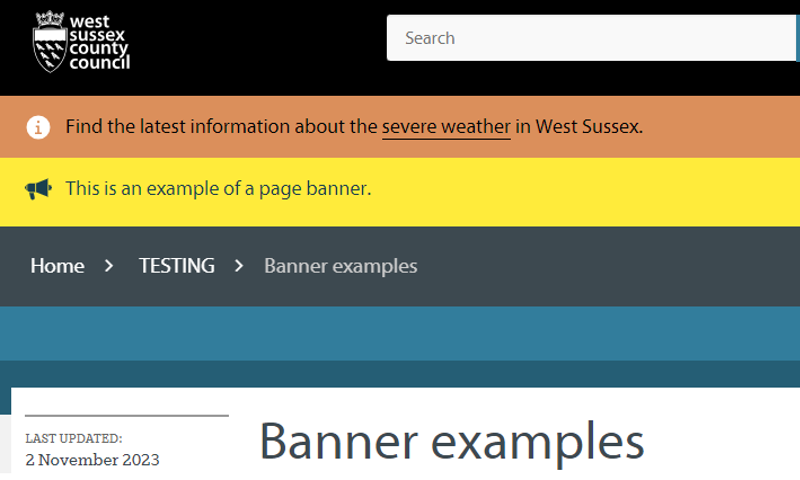
Using banners
- Selecting from a variety of colours and icons, you can set:
- a site wide global banner to appear on every page on the website
- a section banner to appear on every page in a section i.e. a parent page and every page that sits under it
- a page level banner i.e. a banner that shows on the specific page only (note: any page level banner will over-ride a section level banner that would otherwise appear on the page).
- Banners can include links and basic formatting such as bold text.
- Banners have a character limit of 500 characters including spaces.
Colour and icon options
Colours
A selection of colours are available to use for the background of published banners.
-
Blue
-
Dark
-
Green
-
Orange
-
Purple
-
Yellow
-
Light blue
-
Light orange
-
Brown
Selecting a colour
- Prominent colours for high visibility or contrast against the site's colour theme are yellow and purple, although note that this might not apply to everyone (for example, for those with vision impairments).
- Colours should not be used to imply meaning on their own.
- Only use the dark/black banner for major events requiring mourning or marking respectfully, for example the death of a significant person.
Icons
Alongside the colour, each banner requires an icon to be included. The following are available to use:
Icons should be used appropriately to match the content of the published banner.
Additionally, there is a beta icon that can be applied to pages as a 'beta banner' to advise users where a new service or piece of content is published as a beta version.
Tracking banner link use
To track the number of clicks on any link used in the banner adjust the HTML of the link to include...
Alternatives to banners
It is not always advisable to use a page banner to highlight important information. It may be better to include any messaging in the body content of the page. You can highlight text in body content using the alert macros.